LILIANA PORTER: TWO MATERIALITIES
BY MATTHEW EZERSKY, LILY KRAKOFF, YUANZHE OUYANG, AND JENNA WYMAN
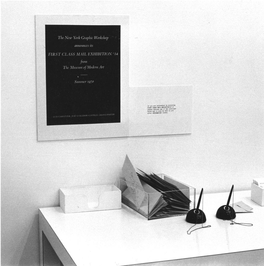
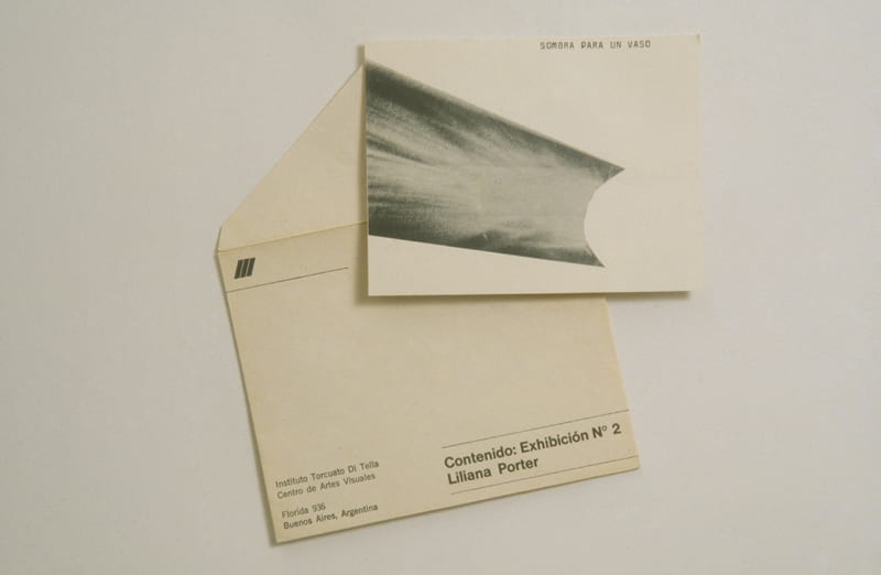
Liliana Porter’s artistic practice has many exciting elements, but our group was particularly fascinated by her mail art. There are a wealth of Latin American artists’ takes on mail art that range from examples intended to circumvent the censorship of the region’s oppressive political regimes of the 1960s-80s to works meant to challenge conventional modes of art circulation. Porter used mail art herself in various instances, such as on the occasion of her 1969 exhibit at the Instituto Torcuato di Tella in Buenos Aires, Argentina. The postcard shown below is beautifully understated, serving as an interesting foil to the vibrant and playful works that she would become known for. Porter engages recipients by requesting an object be placed near the cast shadow in the printed work in order to complete it.
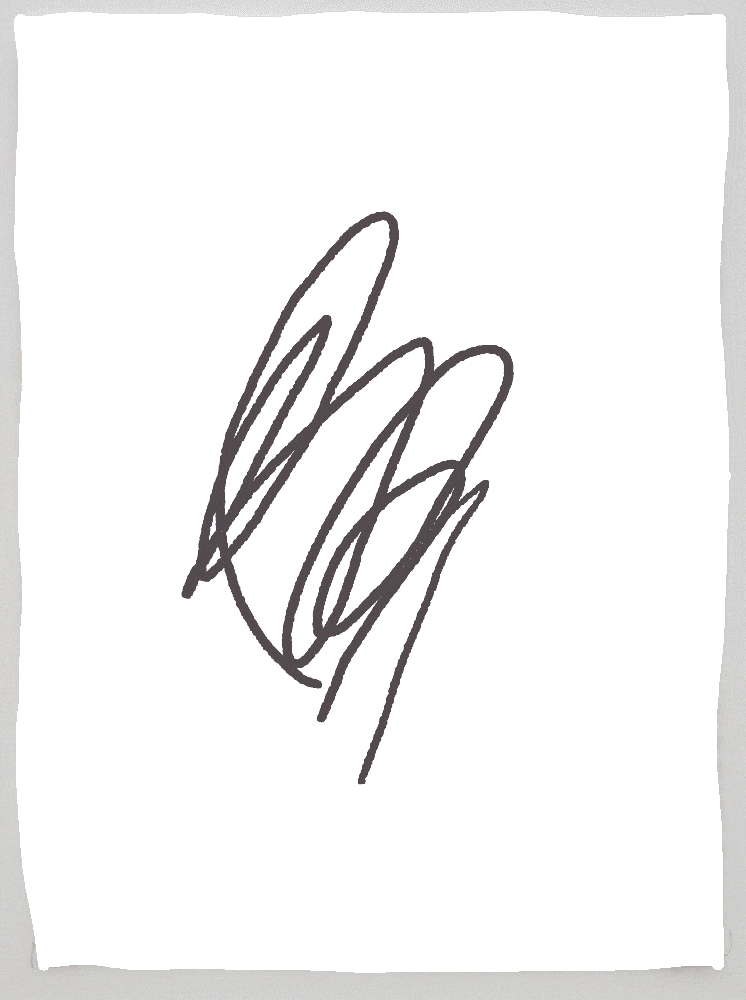
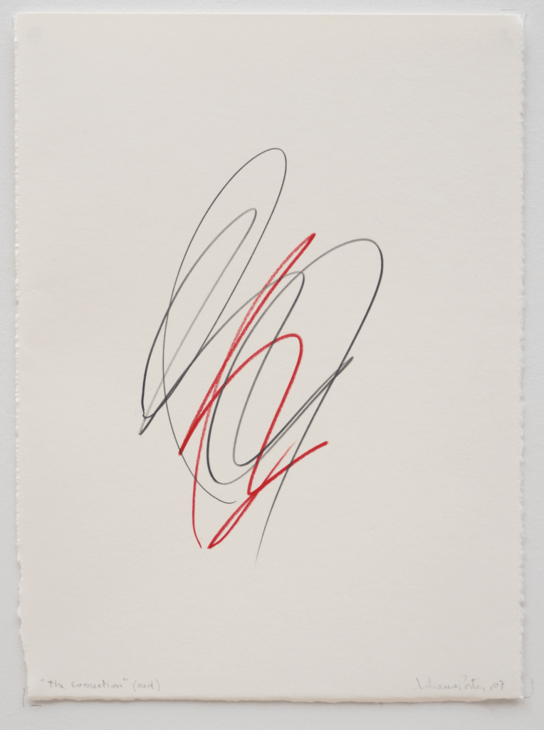
Our group was inspired to embrace this aspect of Porter’s work in our exhibition by making a work of mail art with one of Porter’s images. Our postcard features The Correction (red) (2007), which we selected in consultation with the artist. We invite the recipients of the postcards to contribute to the work by adding their own scribble (i.e. their own “correction”) to the work. In an effort to relate the physicality of mail art to the virtual quality of this online exhibition, we also invite our audience to access this page via QR code.
Although Porter created mail art in the late 1960s and 1970s, this concept is still relevant today. It is a fascinating, direct way to communicate through art. With this project, we play between the use of a mailer (or postcard for exhibition promotion) and mail art. We selected an image of an artwork that is not on view in the Mead’s exhibition, but that links to works in the exhibition. We know how overwhelming emails and online communication can be; most days, our inboxes are oversaturated with information. By providing members of the Amherst College community with a carefully crafted piece of physical mail, we hope to cut through this excess and communicate intentionally. The psychological effect of holding a work of art (even a reproduction) in one’s hands and engaging with its intricacies is powerful, and we hope to provide our community with an interactive and meaningful experience guided by Liliana Porter’s art.
All images are courtesy of the artist.
You must be logged in to post a comment.